As a business owner, you most likely already know how critical it is to be active and visible online.
-
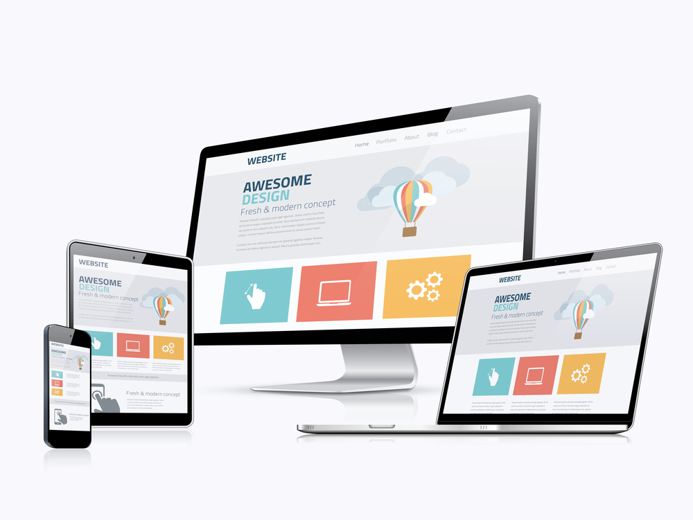
Easy To Read – Both Mobile and Desktop
Mobile use is dominating and mobile devices account for 52.99% of global Internet traffic. For some consumers and clients, your website could be their first impression of you. Maintaining a strong web presence opens this mode of communication between you and your clients and builds credibility. Google prioritizes mobile-friendly sites over sites that aren’t mobile friendly when listing search results. Considering the oversaturation of websites online, having a mobile-optimized website can make your business stand out.
Websites that aren’t mobile optimized usually have longer load times and smaller text. Causes of slow-loading content relate to images displayed on the site not being optimized and code that needs to be cleaned up. This frustrates customers and causes them to leave your site faster. Optimizing your website and holding on to these visitors will improve your website ranking on search engines and increase customer satisfaction.

-
Easy To Navigate – Simple is key
Just because your navigation is built into the site doesn’t mean it’s doing the best job of giving your visitors what they want.
Navigation can make or break your website’s overall performance when it comes to retaining visitors, keeping them engaged and driving them through the conversion funnel.
Strong site navigation makes it easy for visitors to quickly find the information that interests them, sans a potentially frustrating “hunt.” It also helps search engines index your important information efficiently and effectively.
Conversely, poor navigation does more harm than good. It confuses visitors and sends them scurrying for the exit. When they can’t find what they’re looking for, you don’t get the conversion you want, either.
-
Colors, fonts, and Images – Your design is everything.
What does this mean?
Don’t pick the colors of your website randomly. You should choose your text and background colors very carefully, they have a huge impact on the overall experience of your visitors. If your website is just a collage of your favorite colors, it probably going to look like a 70’s poster.
You don’t want to use backgrounds that obscure your text or use colors that are hard to read. Dark-colored text on a light-colored background is easier to read than light-colored text on a dark-colored background.
You also don’t want to set your text size too small (hard to read) or too large (it will appear to shout at your visitors). All capitalized letters give the appearance of shouting at your visitors.
Keep the design of your website consistent and clean. Find colors and fonts that match your business and logo, this is going to help a lot to improve your brand and helps your visitors to feel familiar with your business.


